mls 2026 campaign: come kick it
project overview
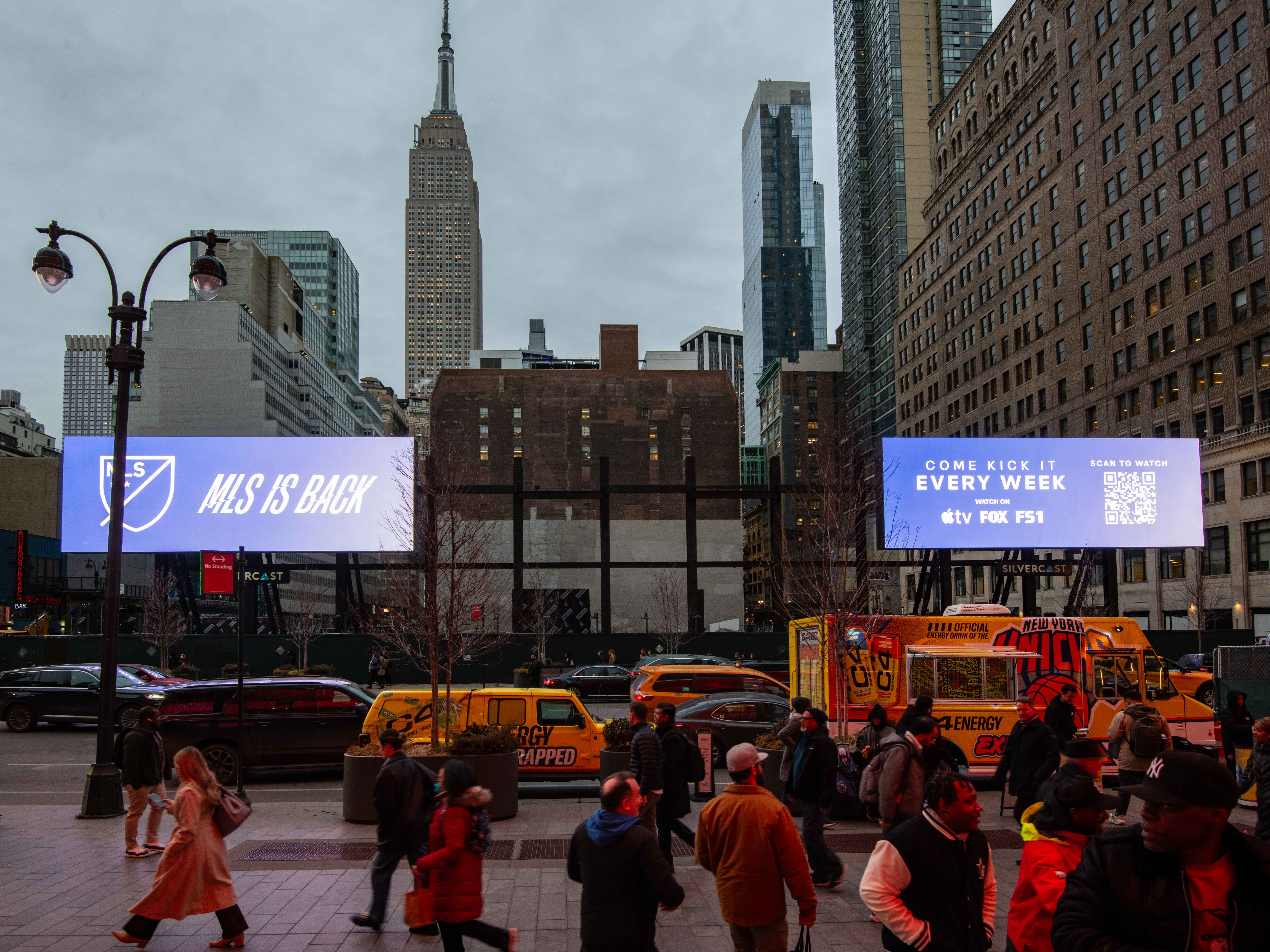
with all eyes on soccer in the united states in 2026, we branded this season's campaign with a radically refreshed, vibrant, energetic and modern tone to kick off the start of the 2026 mls season. the traditional red, white, and blue color palette was reimagined – breaking the conventional standard to burst with a new spectrum of hues, not only reflecting the energy of the campaign, but reflecting the wide array of players, fans, stars, cities, and clubs represented across the league
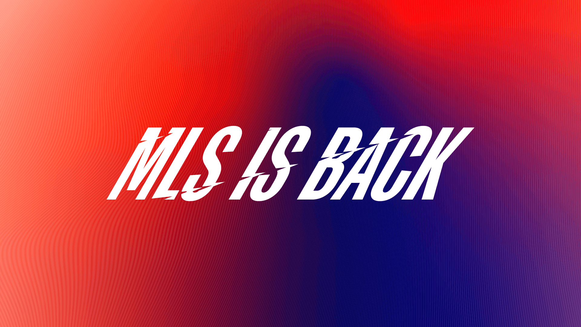
another area where convention was broken: typography
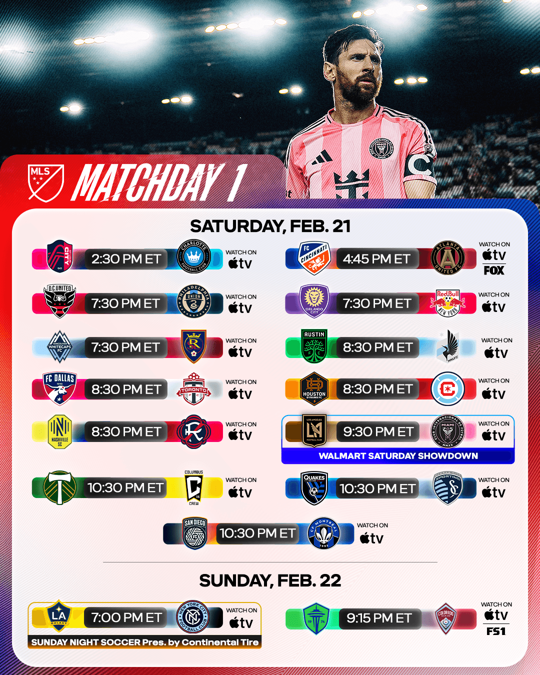
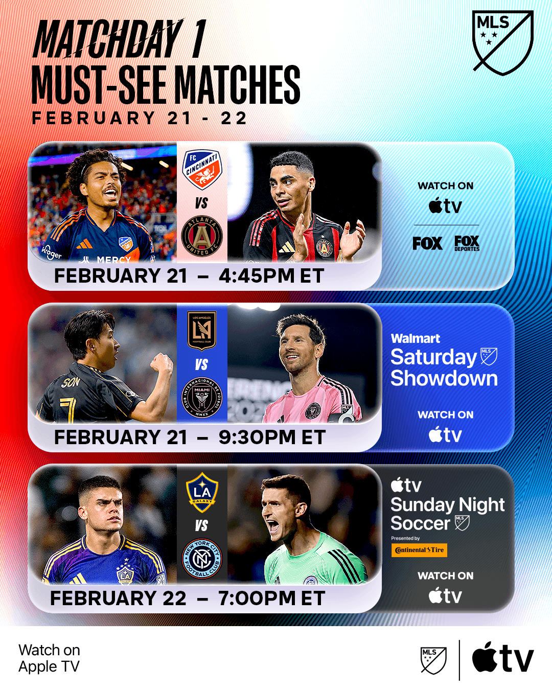
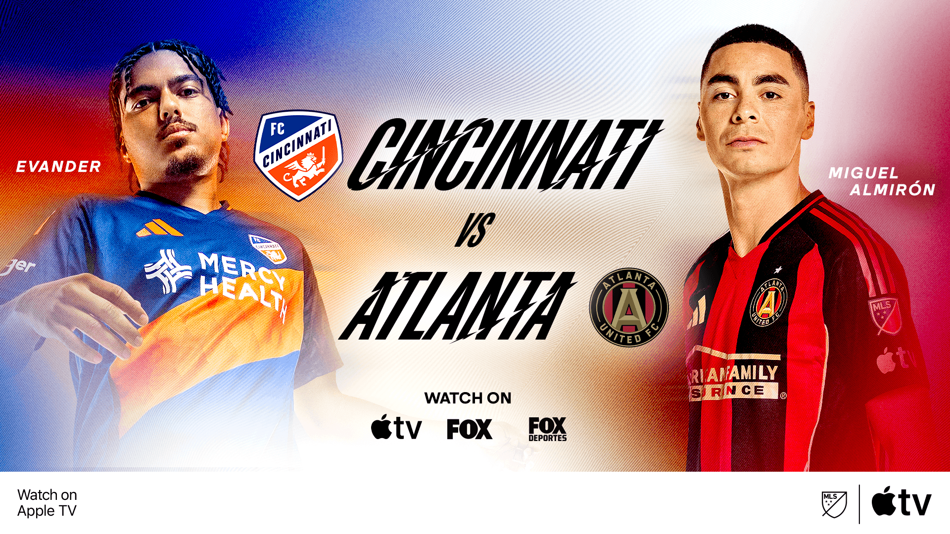
as motion and energy were main strategic pillars for the campaign, we took this and ran with it. nothing encapsulates the beautiful game better than a goal…taking inspiration from the motion of a shot, the standard typography of mls' brand was slightly tightened, and then dramatically skewed: giving the typical mls typeface a whole new feel and attitude to match the intensity of the game.
*project case study still in-progress
project type
campaign identity
year
2026
my role
Designer, Motion, Art Direction
client
mls

this unique type treatment is present in the natural form of the type, but also in motion. standard motion principles were integrated into the movement, and also into a unique animated treatment to main headlines. precise, razor-edged motion ripples through the type in kinetic fashion — the same angle you would hit a clean strike of the ball — to give the text an extra level of grit and personality. It feels fast, expressive, and always moving.


design lead:
art direction, motion, design, photo, creative photography, strategy: